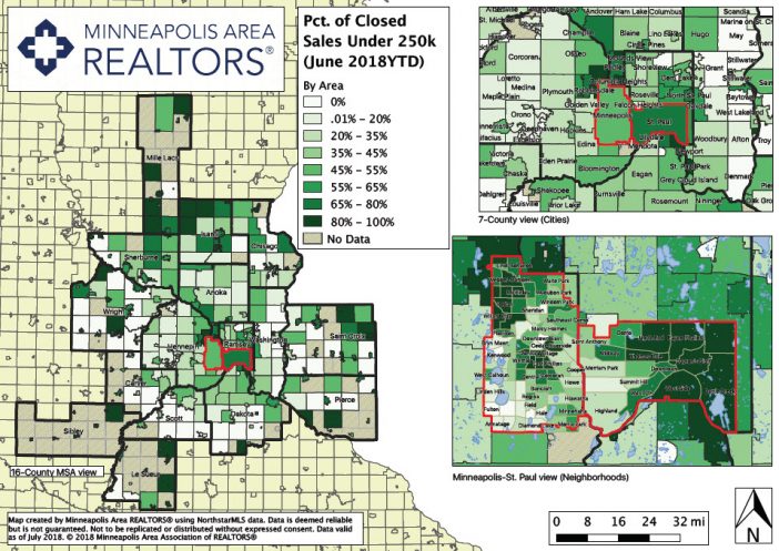
Here at MAAR, we’re always coming up with new ways to convey information to our members, the media and the public. In our research department, we’ve been working on creating a series of maps that help us visualize and better understand our regional housing market. For too long, we’ve relied on tables, bar charts and trendlines to communicate complex information. But housing is inherently spatial while data tables and trend lines are not. That geographical element is one of many factors driving market dynamics, albeit an important one.
So why don’t we visualize spatial information in a spatial context? Well, we do now! We’ve plotted many different market indicators on a map. You’ll want to use the legend to understand what the map is conveying and the what the various colors on the map represent. The time frame is 2018YTD (through the end of June) and all percent change figures are year-over-year from the same period in 2017. Each map has three extents: the entire 16-county region, a zoomed-in view featuring most of the 7-county metro area and of course a neighborhood map showing granular, local trends in both Minneapolis and St. Paul proper. We hope to update these annually or bi-annually to start with, though we’d eventually like to produce them more frequently.
It’s time we put our MLS data on the map! Please enjoy these maps responsibly.
For questions, comments and media inquiries, please contact David Arbit (952-988-3150)
*Trivia Bonus: the art and science of map-making is called “Cartography”
Powered by WPeMatico
